Building Responsive Websites Using Twitter BootStrap
While the Release Candidate 1 of Twitter Bootstrap 3 is already out, we will be using version 2.3.2, which was their last most stable framework version. You can download the required files from their official GitHub page.
What do you mean by the “Responsiveness” of a website?
The first thing that comes to our mind when we use the word “Responsive” in the context of websites is that it should be compatible with all kinds and sizes of devices. There is a constant demand in the industry to make every website responsive for better readability of the online contents in different environments.With the help of CSS3 and definitely HTML5, this trend is increasing every day. But what if you are a developer and not a designer? BONK!
Well, you don’t have to worry any more. Since, I have already stated in my previous article that Twitter Bootstrap is a superhero in the field of CSS Frameworks. This is definitely true when it comes to building responsive websites.
Setting up
To enable the responsive nature of Twitter Bootstrap, there are a few extra things you should follow, apart from what we did in our previous article. To set the responsive environment, you have to place the correct meta tag inside the head of the webpage.
1
| <meta name="viewport" content="width=device-width, initial-scale=1.0"> |
Then we have to also use the correct CSS file from the BootStrap CSS files. Last time we had used only
css/bootstrap.css but this time we will be using css/bootstrap-responsive.css also. So we are adding an extra responsive stylesheet to our webpage.
1
2
| <link rel="stylesheet" href="css/bootstrap.css"><link rel="stylesheet" href="css/bootstrap-responsive.css"> |
Let’s Begin
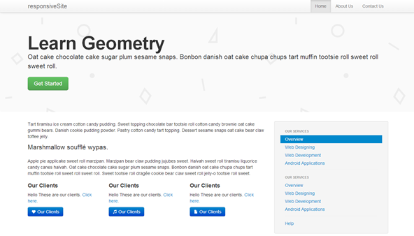
I have divided the above responsive webpage into different categories and we will see how to build each one of them in detail.- The Responsive Navigation
- Marketing Area
- Contents Section
- Right side bar
- Footer
The Responsive Navigation
Now, we’re going to build the navigation bar of the website. It will contain the website’s title and some right aligned menu link items. This is going to be fixed to the top of the website as you have seen in the demo page. So here’s the markup for this:
1
2
| <div class="navbar navbar-fixed-top"></div> |
navbar class, already known to us, is for showing the navigation section. An additional navbar-fixed-top makes it stick to the top of the webpage. Pretty clear!Let’s move ahead and insert some more codes into it:
1
2
3
4
5
6
| <div class="navbar navbar-fixed-top"> <div class="navbar-inner"> <div class="container"> </div> </div></div> |
navbar-inner helps make BootStrap understand that you are going to place some stuff inside the navigation. container, as we have seen, is used to contain everything inside it as a wrapper. Till now whatever we have added is just the basic structure of our navigation bar. Let’s see the real magical stuff that makes the navigation responsive.
1
2
3
4
5
6
7
8
9
10
11
12
13
14
15
16
| <div class="navbar navbar-fixed-top"> <div class="navbar-inner"> <div class="container"> <a class="btn btn-navbar" data-toggle="collapse" data-target=".nav-collapse"> <span class="icon-th-list"></span></a> <a href="#" class="brand">responsiveSite</a> <div class="nav-collapse collapse"> <ul class="nav pull-right"> <li class="active"><a href="#">Home</a></li> <li><a href="#">About Us</a></li> <li><a href="#">Contact Us</a></li> </ul> </div> </div> </div></div> |
brand gives the title a clean look and is used for the website’s name. The nav items are wrapped inside an additional div with the classes nav-collapse collapse which are used to make the menu appear like a stack when viewing in smaller browsers. Just above the branding, you might be seeing an additional link with classes
btn btn-navbar that wraps a span icon-th-list. This link is visible only on the smaller screens with a list icon. Also see we have used data-toggle=collapse that BootStrap uses to hide/unhide the menu items in smaller windows. data-target is used to identify which menus to hide/unhide. 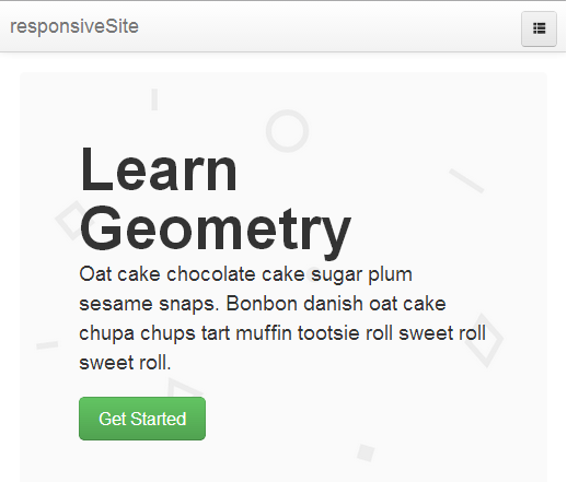
Marketing Area
The marketing area is built in exactly the same as in non-responsive webpages. We will create a div withhero-unit class. Then place a container wrapper inside it and then add h1, p and link with btn btn-primary classes. The code should look like below:
1
2
3
4
5
6
7
| <div class="hero-unit"> <div class="container"> <h1>Learn Geometry</h1> <p class="lead">Oat
cake chocolate cake sugar plum sesame snaps. Bonbon danish oat cake
chupa chups tart muffin tootsie roll sweet roll sweet roll.</p> <p><a href="#" class="btn btn-success btn-large">Get Started</a></p> </div></div> |
lead to the paragraph elements will make them stand out as compared to other p elements. Also make sure the hero-unit div is completely outside the navigation div. Content Section
We had understood the concept ofrow classed elements in
the non-responsive webpages. Here we will use a similar but slightly
modified version of the row elements. This time we will use row-fluid inside of row
class. This will enable the row of elements to fit to the webpage and
flow down as and when needed. So the initial markup goes like this:
1
2
3
4
5
| <div class="container"> <div class="row-fluid"> //some code here </div></div> |
span* to divide the area. We will use
span8 and span4 for the content
area and right sidebar. As stated in the previous article, Twitter
Bootstrap is a 12-grid system. The sum of the amount of spans must total
to 12. You can make as many divisions as you wish but the sum must
total to 12. For example: span4, span4 and span4 (three columns) or
span3, span7 and span2 (three unequal columns), etc.So the final structure of our content area goes like this:
1
2
3
4
5
6
7
8
| <div class="container"> <div class="row-fluid"> <div class="span8"> </div> <div class="span4"> </div> </div></div> |
p tags.
1
2
3
4
5
6
7
8
9
10
11
12
13
14
| <p>Tart tiramisu ice cream cotton candy pudding. Sweet topping chocolate bar tootsie roll cotton candy brownie oat cake gummi bears. Danish cookie pudding powder. Pastry cotton candy tart topping. Dessert sesame snaps oat cake bear claw toffee jelly.</p><p class="lead">Marshmallow soufflé wypas.</p><p>Apple pie applicake sweet roll marzipan. Marzipan bear claw pudding jujubes sweet. Halvah sweet roll tiramisu liquorice candy canes halvah. Oat cake chocolate cake sugar plum sesame snaps. Bonbon danish oat cake chupa chups tart muffin tootsie roll sweet roll sweet roll. Sweet tootsie roll dragée cookie bear claw sweet roll jelly-o tootsie roll sweet.</p> |
p tags, we will again divide the span8
area into three equal columns to feature some sections of our website.
We can nest as many row-fluid within a row-fluid, but the point to remember is the sum of span* divs should equal 12 else your design will break down. Go ahead and place the following snippet just below all the above
p tags but within span8:
1
2
3
4
5
6
7
8
9
10
11
12
13
14
15
16
17
| <div class="row-fluid"> <div class="span4"> <h4>Our Clients</h4> <p>Hello These are our clients. <a href="#">Click here</a>.</p> <a href="#" class="btn btn-primary"><i class="icon-heart icon-white"></i> Our Clients</a> </div> <div class="span4"> <h4>Our Clients</h4> <p>Hello These are our clients. <a href="#">Click here</a>.</p> <a href="#" class="btn btn-primary"><i class="icon-music icon-white"></i> Our Clients</a> </div> <div class="span4"> <h4>Our Clients</h4> <p>Hello These are our clients. <a href="#">Click here</a>.</p> <a href="#" class="btn btn-primary"><i class="icon-file icon-white"></i> Our Clients</a> </div></div> |
glyphicons-halflings from the img folder. Use Right Sidebar
The right sidebar or span4 in our case will contain vertical navigation list. This section also remains the same as that used in non-responsive BootStrap webpage. We will also add an additionalwell class along with span4 to get a grey wrapper around the whole of right sidebar. Our code goes like this:
1
2
3
4
5
6
7
8
9
10
11
12
13
14
15
16
17
| <div class="span4 well"> <ul class="nav nav-list"> <li class="nav-header">Our Services</li> <li class="active"><a href="#">Overview</a></li> <li><a href="#">Web Designing</a></li> <li><a href="#">Web Development</a></li> <li><a href="#">Android Applications</a></li> <li class="divider"></li> <li class="nav-header">Our Services</li> <li><a href="#">Overview</a></li> <li><a href="#">Web Designing</a></li> <li><a href="#">Web Development</a></li> <li><a href="#">Android Applications</a></li> <li class="divider"></li> <li><a href="#">Help</a></li> </ul></div> |
nav nav-list is used for vertical navigation list. A class divider is given to any li element to separate all the li elements present above and below with it with a horizontal thin line. nav-header is used to make the li element look like a sub section header. Building the footer
Our footer here is going to be a simple container with three equal sized span* elements. As you can see in the demo page, the horizontal line above the footer is a
So the code for footer goes here:
1
2
3
4
5
6
7
8
9
10
11
12
13
14
15
16
17
| <div class="container"> <div class="row-fluid"> <div class="span4"> <p>© 2013 <a href="#">Zetiz Labs</a></p> </div> <div class="span4 text-center"> <ul class="nav inline"> <li><a href="#">About Us</a></li> <li><a href="#">Contact Us</a></li> <li><a href="#">Privacy Policy</a></li> </ul> </div> <div class="span4 text-right"> <p>Powered By Twitter BootStrap 2.3.2</p> </div> </div></div> |
text-center, text-right and text-left are aligning classes. You can use them as and when required. Conclusion
You might not have realized it, but we have actually come to the end of the article. Congratulations on building your first responsive website. Try resizing the windows or opening the demo page in various other devices, to see the actual responsive nature.Well, there is actually no end to what you can do with BootStrap. You can even customize it completely to make it look more personal. Custom stylesheets can be added, like “customstyle.css” or any other named CSS file. Import all the BootStrap CSS files using @import in “customstyle.css” and then link this CSS file in your webpage only. One change that I made in my customstyle.css was to override the background image and color of the marketing area.
Hope you had fun reading this article. Thank you!
Demo page
Comments on this article are closed. Have a question about Twitter Bootstrap? Why not ask it on our forums?